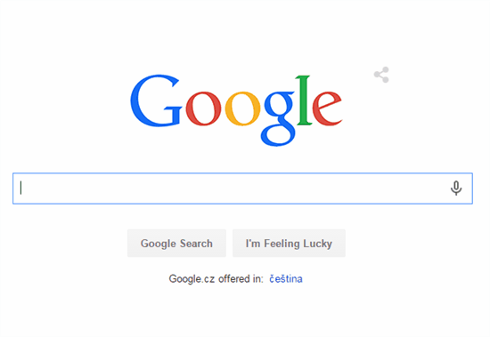
Colors remained, the font has changed. Google is another of the companies that have moved to logo font. What do you think?
As part of the restructuring of the company Google to "parent" Alphabet come and change the logo Google - the third in the last five years, and the fifth in the history of the company. While previous changes were happening still within the limits of serif fonts, recently used Google's own Product Sans sans-serif font. Designers also alleviate the saturation of colors.

In an official statement, Google said it changed the logo came for it to be readable on all devices, not just on the desktop. On very small screens with lower resolutions (read - the watch) Indeed sans serif font renders better than serif font.
Comments
Post a Comment
Please leave your comments and suggestions here.